
TOKYO – The new emblem designs chosen by the organizing committee of the 2020 Tokyo Olympic and Paralympic Games appear to have impressed people with their simplicity and distinctly Japanese sensibility.
Eight months after the former designs were withdrawn, the organizing committee picked the new ones, which feature checkered patterns, from among 14,599 entries.
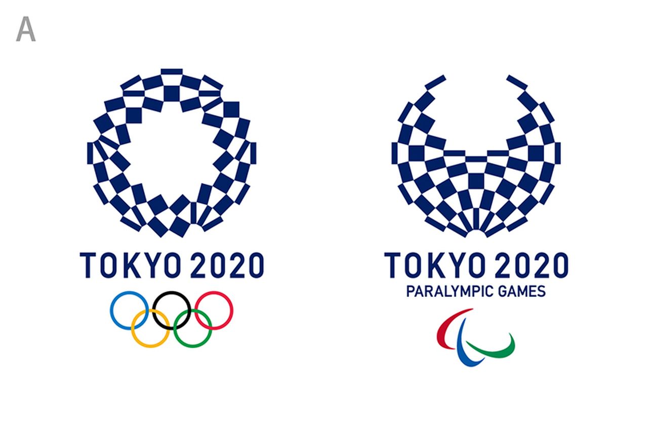
Rendered in a single color, their traditional pattern – known as ichimatsu moyo – is strikingly Japanese, prompting athletes to praise them as “simple and beautiful.”
The ceremony to announce the new emblems began at about 3 p.m. Monday in Tokyo’s Toranomon area.
“These works are like my children. I hope they will be widely used in various ways,” designer Asao Tokoro, said during a ceremony Monday in Tokyo. He received a certificate of commendation from committee President Yoshiro Mori.
The committee’s Tokyo 2020 Emblems Selection Committee started its final screening process earlier the day. The meeting began with a free discussion among committee members, who considered about 40,000 opinions sent from the general public. There reportedly were many comments from the public saying Tokoro’s designs reflect Japan’s and Tokyo’s unique taste.
Each member of the selection committee cast a vote, and Tokoro’s designs, tentatively called Plan A, gained a majority of 13 ballots. The designs tentatively called Plan D got five; Plan C two; and Plan B one.
About the selection committee’s choice, Cultural Affairs Agency Commissioner and committee head Ryohei Miyata said at a press conference after the announcement: “Though the designs are in a single color and look quiet, they actually tell people a lot. They have a Japanese uniqueness deep inside them.”
The new emblems for the Tokyo Games, which have finally been decided, have not been badly received so far.
Rikako Ikee, a 15-year-old swimmer who will compete in the Rio de Janeiro Olympics this summer, said, “The inside of the [Olympic Games] design looks like a flower, and I think it’s really Japanese. I’ll work hard to train myself, with the Tokyo Games deep in my thoughts.”
Tokoro is a Tokyo Zokei University alumnus, and has been working on creating pattern designs based on the themes of “connecting” and “attaching” since the terrorist attacks on the United States in September 2001. His works are distinctive in that they use simple, geometric designs that create a feeling of spatial expansion. The emblems chosen by the selection committee were reportedly created using the same approach.
Both the Olympics and Paralympics emblems are comprised of 45 elements, under the belief that the two events are equal.
Asked at the press conference about what motivated him to design the emblems, Tokoro replied: “The Olympic Games has been an event of my dreams since I was a child. I can’t be an athlete, but I thought I could be involved with the designs.”
Regarding the fact that Tokoro’s designs were the only ones among the candidates to feature a single color, he said: “I wanted the designs to be graceful, like in Edo-komon [kimono dyeing]. As the [Games] are summer events, I also tried to make the emblems look cool.”
According to his website, Tokoro’s works include glass walls at the Dai Nagoya Building in Nagoya. In 2006, one of his works was included in Japanesque Modern, an attempt to select the 100 things that best combine Japan’s traditional culture and cutting-edge technologies.
A Tokyo architect who has purportedly known Tokoro for about a decade said, “He can apply a single design to various products.” He also said Tokoro was a “warm person.”
![]()
(c) 2016, The Japan News/Yomiuri · No Author